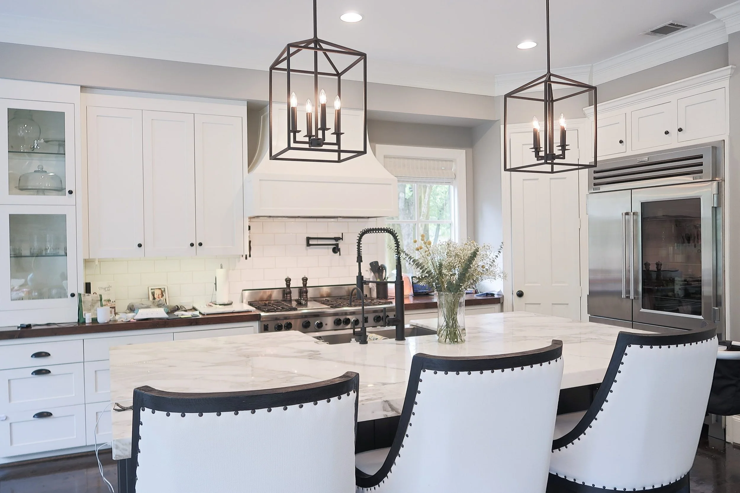
Our Kitchen Makeover
When our kitchen faucet finally broke (hip hip, hooray!)...I decided to condense the myriad finishes in the kitchen. We had: stainless steel, polished chrome, oil-rubbed bronze, satin nickel....it was like someone had a mad dash through the hardware store ala Supermarket Sweep and grabbed whatever they could find. To reduce confusion, I opted to choose a matte black faucet. Of course, it had to be simpler (our previous Prerinse faucet required an engineering degree to wash your hands). It also needed to still look cool and perform well. We installed one that was budget-friendly but it was undersized, underperformed, and the plastic bit where the water comes out felt flimsy in our hands.
Naturally, with the switch of the faucet to matte black, everything else had to be switched out to matte black. Cue my husband's eye roll here.
Our kitchen is lovely. It really is. It was the main draw for us on this house besides its location (well, everything was a draw for us, we looooove this house!). But after you live in a house for a while you start to notice things you'd tweak or have done differently if you'd been the one designing it. Number one thing that had to go, for me, was the pendant lights. I disliked how they took up eye space, blocked light, and directed light downward instead of up and out.
I knew that a lantern style pendant was what I was interested in, but wanted an atypical shape. These pendants from AllModern fit the bill because they are square (they are not wider at the top and narrower at the bottom like a traditional lantern) and they were sleek, black iron, and very minimal. I also liked that they hung from a rod instead of a chain.
The hardest part was actually finding a pot filler that didn't cost more than the kitchen faucet itself! Man, those things are expensive! Amazon, of all places, came through with the win. Instead of $400, I paid about $80 and it was exactly what I wanted: sleek, modern, architectural. Not the ornate, 1800's style that seem to be so popular.


